2022 – 2023
My role
UX Designer and Researcher
Reading time
9 minutes
In compliance with confidentiality agreements, some details have been altered or removed. The designs shown may differ from the original versions.
What’s this all about?
Fotocasa is one of Spain’s leading real estate portals, with over 7 million monthly active users. Since 1999, it has been known for offering one of the largest catalogs of homes to buy or rent.
In Spain’s fast-paced housing market, people browse countless listings in search of the right property. Yet until recently, there was no simple way for them to save, organize, or revisit their favorites.
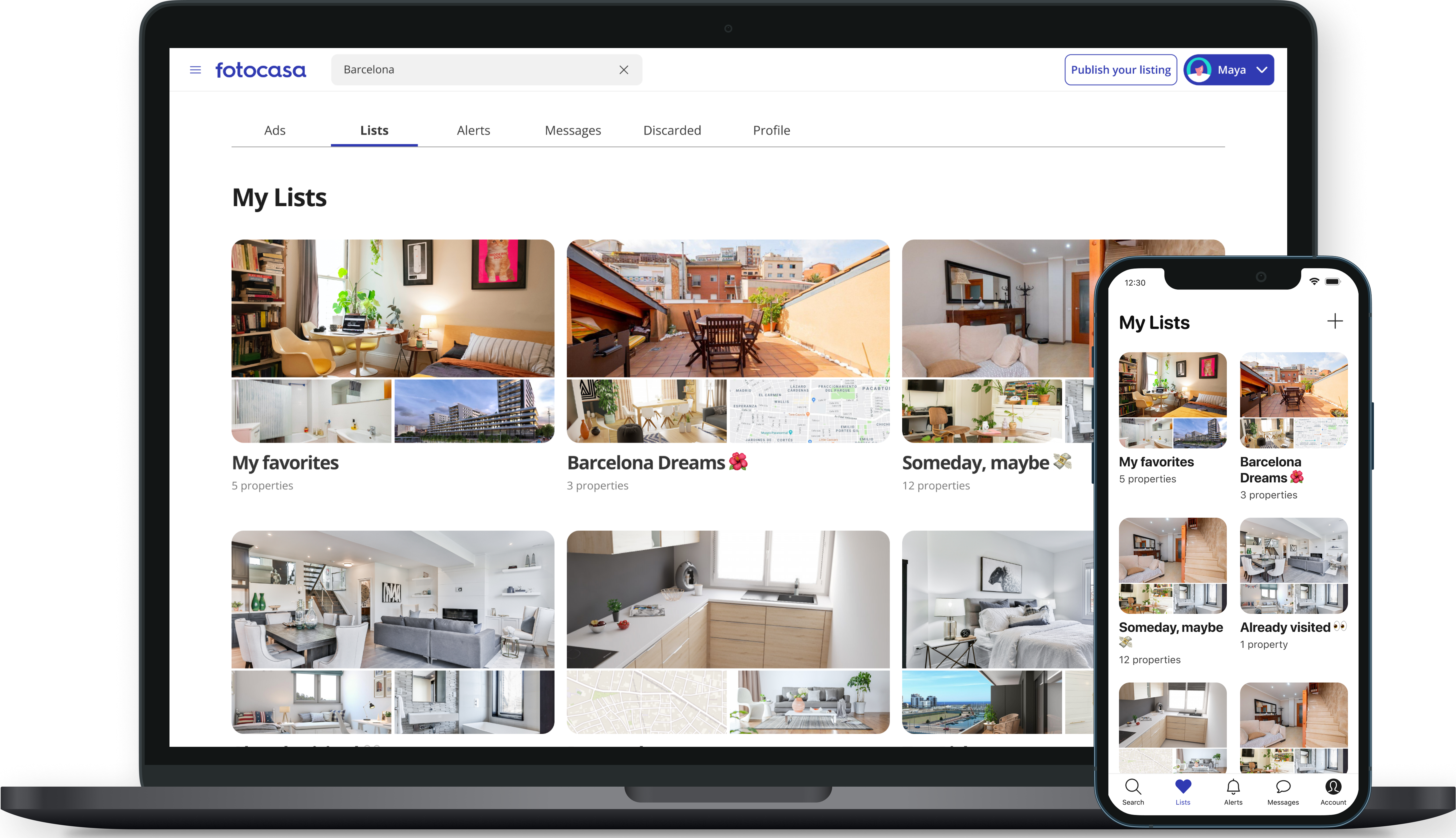
This case study covers how we transformed Favorites into customizable Lists: a feature that reduced friction, boosted engagement, and quickly became one of Fotocasa’s most used tools. It even drew the attention of our biggest competitor, who launched a similar feature shortly after.

How it all started
People come to our site with a goal in mind: to find their next home. But when they stumble upon a listing they like, they’re not always ready to reach out right away, so they find ways to save it and come back later.
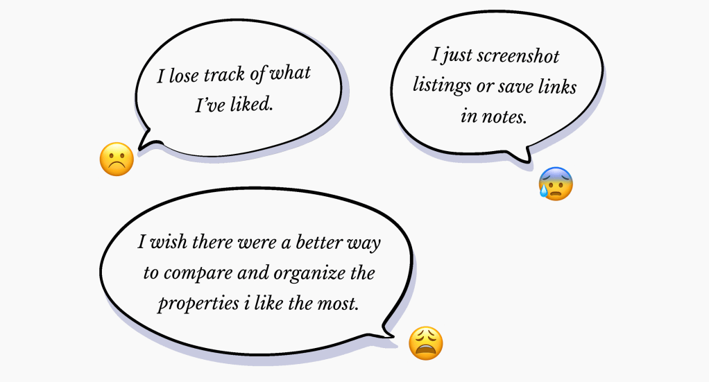
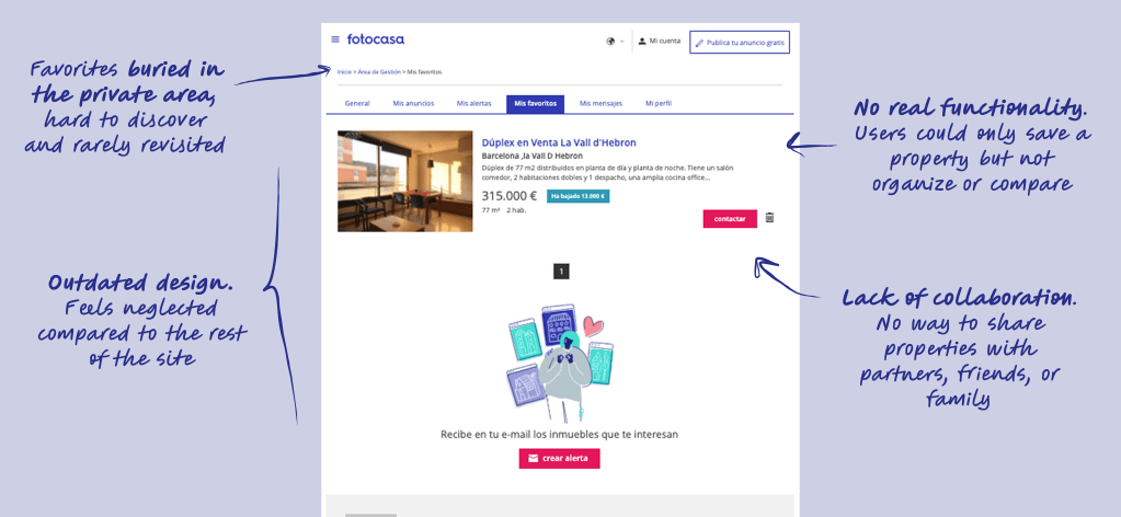
Through channels like app reviews, surveys, and user feedback we noticed a pattern: users were struggling to keep track of the listings they cared about. Our existing feature, Favorites, simply wasn’t doing the job.
Because making the home search experience smoother is what we’re here for, we kicked off a Discovery phase to get to the root of the issue.
A missed opportunity
When taking a closer look at the numbers, we saw that users who took the time to save listings as favorites weren’t casual browsers. These users were highly engaged, generating more leads (sending enquiries) than the average visitor.
Yet despite this, overall usage of the feature remained surprisingly low. Many users didn’t see any real value in the Favorites feature. Some didn’t even know it existed.
As I dug into early desk research, a few patterns began to stand out and the signs were clear:
👀
Lack of awareness. Many users didn’t even realize the feature existed.
💔
Lack of perceived value. Those who did see it, didn’t see a reason to use it.
This gap between visibility and value signaled a missed opportunity. Favorites was being undervalued, both by users and by the business.
We saw an opportunity to reimagine the feature to better align with user behaviors and needs. Not just to help people save homes, but to help them take action, stay organized, and feel more in control of their search.
Looking Outward
Favorites needed to evolve into something genuinely useful and used. But before we jumped into building new features, we needed to understand how other platforms were turning a simple “save” function into something people genuinely loved to use.
We analyzed over 10 platforms from across the globe—real estate, travel, retail, and beyond. And a clear trend began to surface: saving had evolved.
Favorites weren’t just folders, they had become tools. Whether called Wishlists, Shortlists, or Collections, these features gave users more control, more flexibility, and more reasons to come back.
These platforms allowed users to:
- Create and name multiple lists based on their needs or goals
- Share them with partners, friends, or agents
- Collaborate and coordinate with others in real time
- … & more.
The takeaway was clear: favorites weren’t just about saving, they were about organizing, deciding, and moving forward. So then we decided to try our own version of these Wishlists.
Enter: the Lists
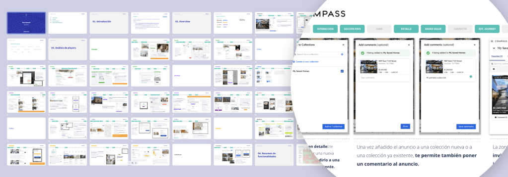
In order to better understand how this feature worked and its potential, I conducted a focused benchmarking. This time analyzing 15 platforms. Again, both local and international. Among our goals, we had:
- Analyze how the Favorite Lists feature was implemented
- Spot common patterns across different platforms
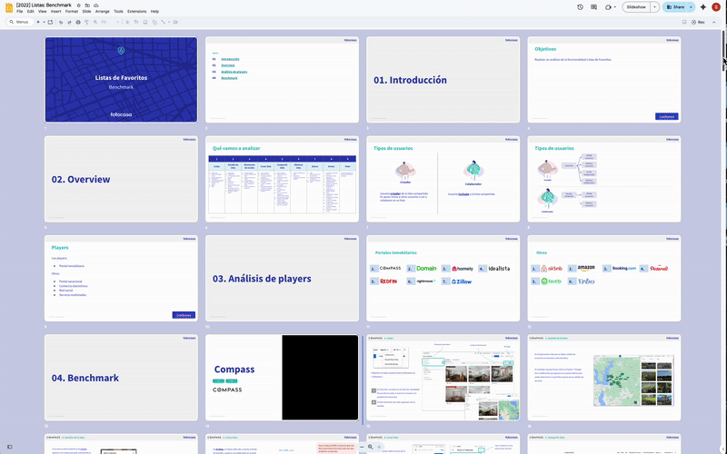
Once we wrapped up the analysis, we moved on to organizing and prioritizing, starting with questions like “What’s the bare minimum it needs to work?” and pushing all the way to “What’s definitely off the table?”
To tackle this, it was crucial to involve everyone on the team (engineers, product manager, data scientist) and to share our findings with other teams, including UX, Marketing and Product.
With all the feedback we gathered, we gradually shaped the first version of what would become our Favorite Lists feature.
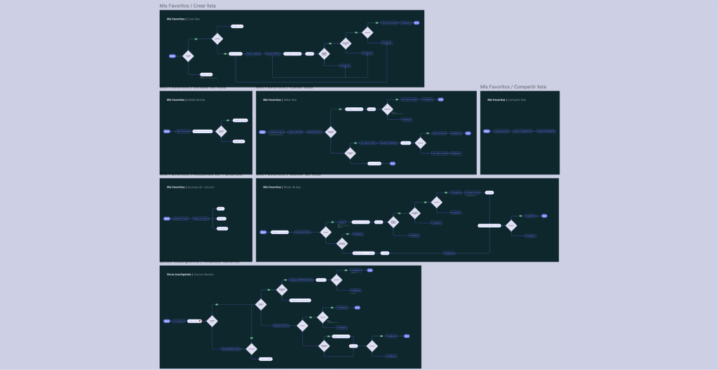
Designing the first proposal
At this stage, I worked on the design proposals for this initial version of the Lists feature. Thanks to several Design Critique sessions and co-creation workshops with the Design team, the concept started to take shape.
Fotocasa has a well-defined writing guide to help shape content and ensure we speak to users in the right tone. But because of the size of this project we partnered with an external UX writing agency who reviewed all the flows.
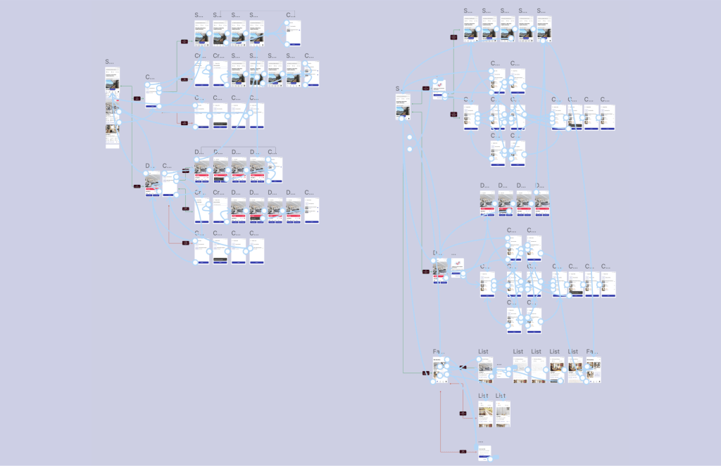
The designs had to work across web (Desktop and Mobile) and apps (Android and iOS).
I had to think through interactions, possible new components creation, and above all, the potential for iteration. This wasn’t about locking in a final design, it was about laying the foundation for something we’d continue refining later on.
With that, I created a testable prototype.
Time to test with Real users
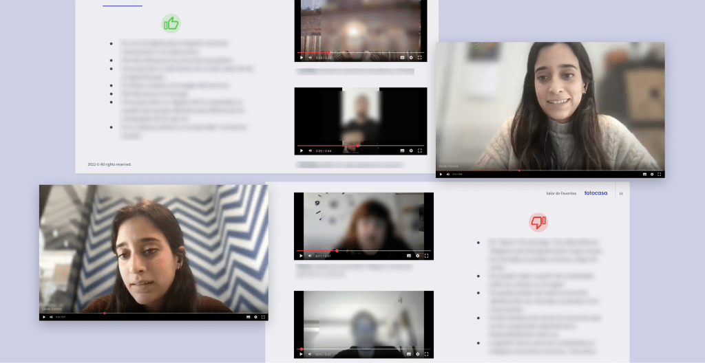
To validate our direction, we started with two usability studies: one remote and one in-person.
Round 1
First we conducted a remote, moderated usability test where we compared the current Favorites and our new Lists concept. The results were promising.
Users, especially those searching with partners, responded positively to the idea of Lists, particularly the collaborative features. Some interaction patterns needed refinement, but overall, we had a strong signal to move forward.
Round 2
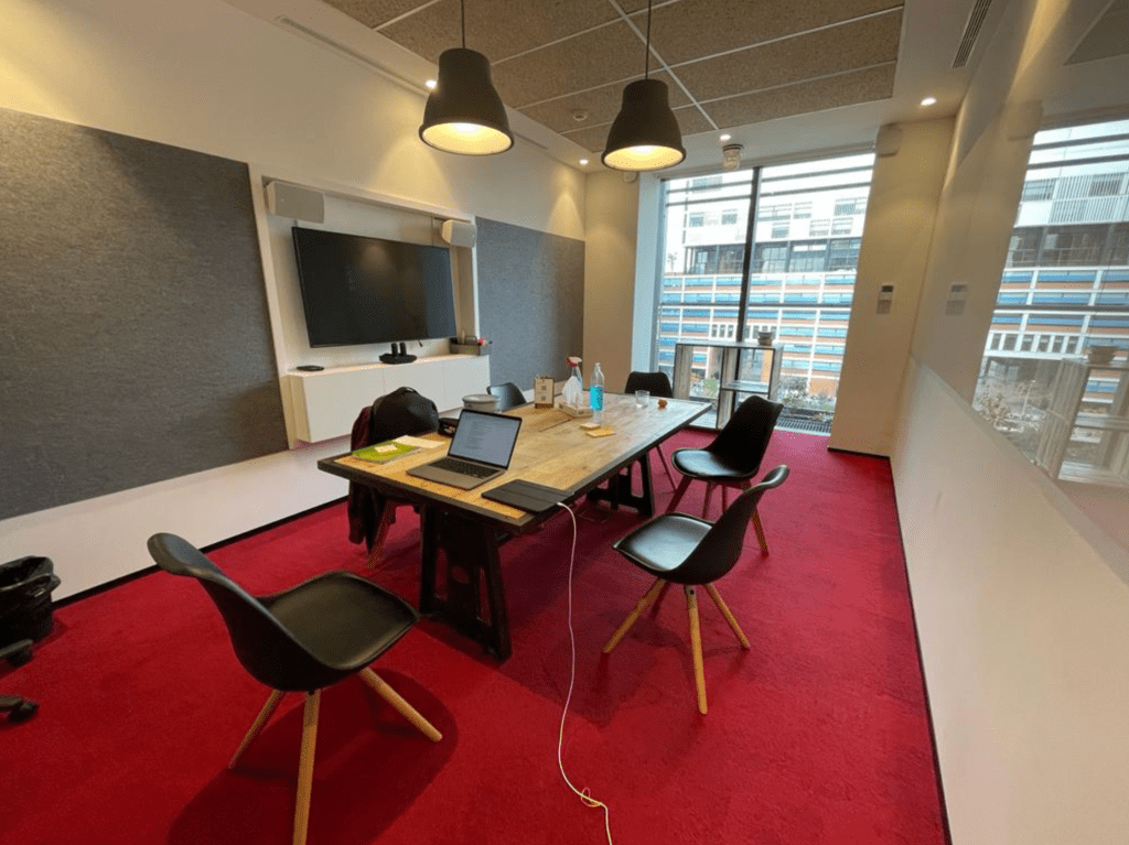
Next, we tested a more realistic MVP-style prototype with 6 users in our Barcelona office. Sessions combined short interviews with usability tests across mobile and desktop.
Feedback confirmed we were on the right track: users found the experience intuitive, and again, the collaborative aspects stood out. Minor usability issues were quickly addressed, and we gathered ideas for future iterations and A/B tests.
From Figma to Production
Since this was a large feature that impacted nearly the entire platform, we decided to roll it out in phases.
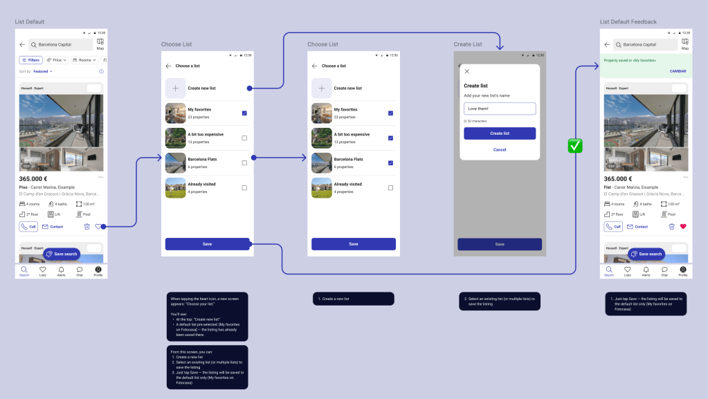
I had to translate each phase into detailed, platform-specific designs, carefully annotating edge cases and interaction details in Figma to guide development across iOS, Android, and Web.

We released gradually, one platform at a time, so we could measure adoption, CSAT, and lead conversion while controlling for risk.
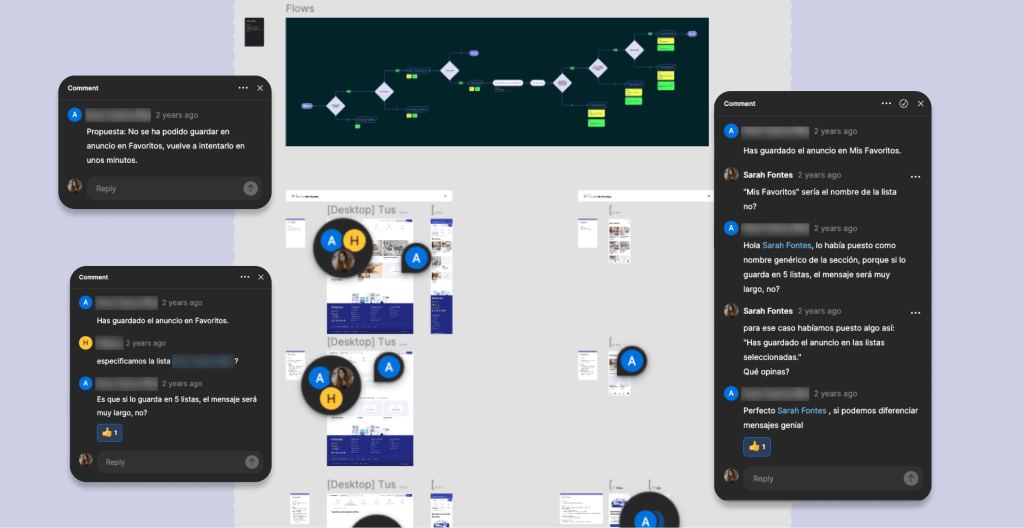
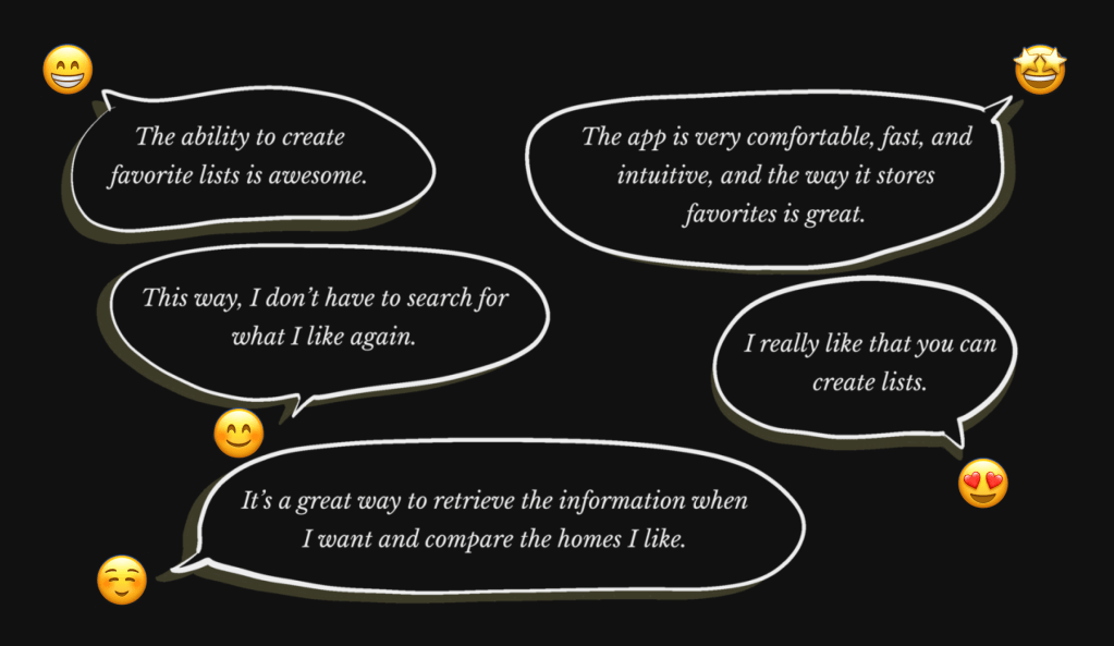
As the lead UX Designer of this project I managed the evolution of CSAT scores, tracked user reviews, and conducted remote usability tests in UserZoom. These feedback channels gave us a clear view of user expectations and usability issues, and the insights directly shaped refinements before each new release.
Impact
The Favorites redesign had a clear impact after launch. During its first year, Lists helped boosting adoption, traffic, and lead generation while also raising visibility for the brand.
While most results are confidential, I can share two highlights:
40%
Of all logged-in visits interacted with Lists in the first year
70%
Average CSAT scores across iOS, Android, and Web
📣 Brand visibility
The new feature became part (and still is!) of several awareness campaigns.

👀 Competitor reaction
And last, but not least… Our Lists feature caught the eye of our biggest competitor, who soon introduced a comparable feature!
Wrapping It Up
This project began with a clear goal: to make the Favorites feature more visible and more valuable. The result was a redesigned experience that not only improved usability, but also drove business results:
Engagement rose significantly, conversion rates improved, and User satisfaction hit a solid 70% across all three platforms.
However, the impact went beyond metrics. It proved how aligning research, product strategy, teamwork, and design execution can lead to features that users truly adopt and enjoy.
For me as a designer it was a turning point. It became a chance to step into a more strategic role, helping shape both the user experience and the rollout strategy, while constantly measuring the impact of each decision.
Working on this project showed me the huge potential hidden in refining what’s already there, especially with the support of an amazing team.
✨ If you made it this far, thank you!
Hope you enjoyed the ride as much as I did designing it.
Hey! The Lists feature didn’t just stop here! 👉 Check out the follow-up case study to see how we explored the next opportunity.
