2023 – 2024
My role
UX Designer and Researcher
Reading time
7 minutes
In compliance with confidentiality agreements, some details have been altered or removed. The designs shown may differ from the original versions.
What’s this all about?
Looking for a new place often takes more than one set of eyes. Whether it’s a partner, a friend, or a family member, home seekers want a second opinion before making a decision.
Fotocasa, one of Spain’s most established real estate platforms, reaches over 7 million people every month who are actively searching for homes to buy or rent, making it a natural space to support that kind of collaboration.
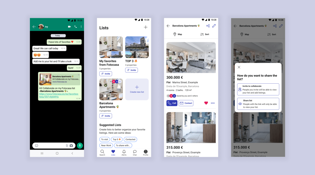
In this case study, I’ll share how we transformed that need for shared decision-making into one of Spain’s first collaborative features in real estate, by reimagining an existing tool on the platform.
The Starting Point
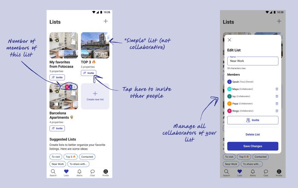
Months earlier, we had redesigned our Favorites feature into customizable, shareable lists. The result was a pioneering feature in Spain’s real estate market that not only made the home search more organized for users, but also strengthened our competitive position.
One of the most meaningful insights we gathered from the previous Discovery phase was that most people don’t search for a new place alone. They involve someone else in the process: a partner, a friend, a parent, or whoever’s opinion matters most.
When conducting interviews with real users, we dug deeper into how this collaboration actually happened, and it was messy: many relied on workarounds such as taking screenshots or sending listings through chat apps.
While these methods worked to some extent, the conclusion was that it was difficult to keep track of shared opinions and preferences.

With Lists already improving how people saved and grouped their favorite homes, we wondered: What if we could make those conversations happen directly inside the Lists?
Instead of pushing users away to chat apps, we could keep them engaged by turning individual Lists into shared spaces.
Back to Research
Since I had already been exploring how Lists (or Wishlists, Collections, etc.) were used in other services worldwide, it was easy to pick up where I left off and expand the research to inform the new Collaboration feature.

This time, I focused on how other platforms implemented collaboration: which devices it worked on, how many collaborators were allowed, what permissions existed, and more. Exploring these approaches was super inspiring and gave me plenty of ideas for our feature.
Setting the Course
By then, I had gathered plenty of insights and feasible possibilities from my research, but it was essential to sync with the other teams, especially the developers, to understand our limitations and opportunities before moving forward. So I organized a series of remote workshops to align expectations and involve everyone from the very beginning.
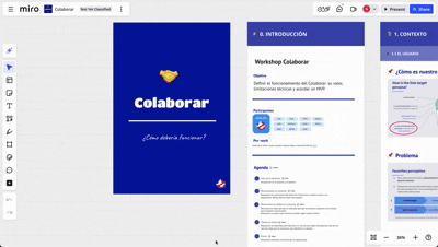
The main objective was to define how our users might interact with Lists in a shared, collaborative way and make sure the experience felt seamless and genuinely helpful.
Inside the Workshops
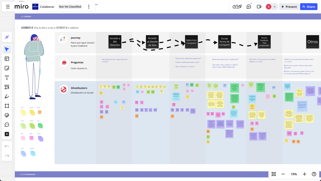
Workshops were designed around two different user perspectives:
👩🦱
User A
—a registered user who creates and shares a list with others
🧑🦳
User B
—the person receiving the shared list
The first sessions focused on “User A”. Together, we walked through their journey step by step, identifying key actions and surfacing questions at each stage. For example:
- How many collaborators can I invite?
- How do I remove someone from a list?
- What happens if I want to leave a shared list?
The following sessions shifted the lens to “User B”. This user might not be logged in or even registered, which introduced a new set of considerations around accessibility, onboarding, and interaction design.
We mapped out their journey in the same way, focusing on moments where they might engage with the list adding their own favorites or deciding to sign up.
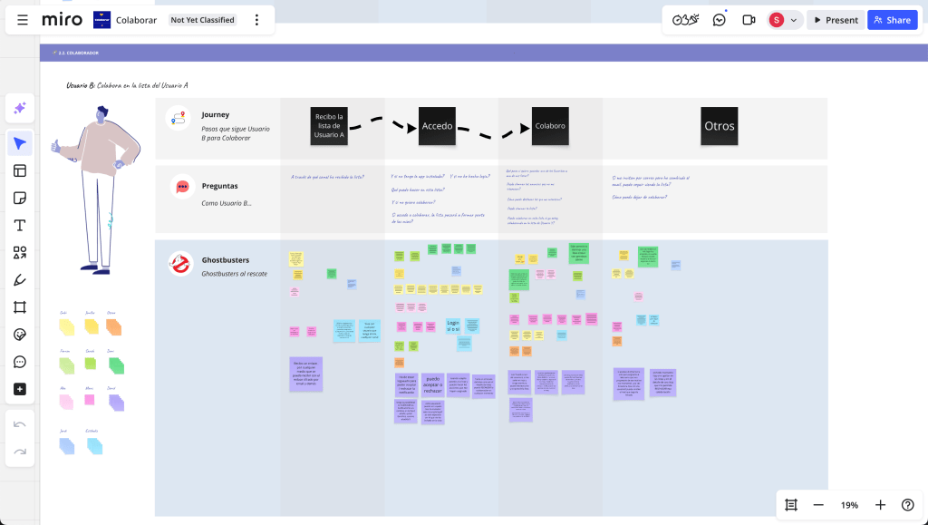
These sessions helped build clarity around the feature and unblocked key decisions.
Designing the Collaboration Flow
All flows were designed in Figma with the intention to capture how users might move through different scenarios across all platforms: Web, Mobile Web, iOS, and Android.
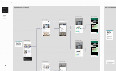
At that point, users were already creating lists and sharing them with friends and family. The challenge here was to build a balanced design that provided meaningful collaboration options without overwhelming users.

Countless decisions had to be made, from straightforward details to highly complex ones. Fortunately, I had the support of the Design team, which allowed each iteration to go through rounds of Design Critique sessions. Presenting the work to the UX team and incorporating their feedback helped refine both the interaction and the visual language of the feature.
Bit by bit, the experience took shape.
Validating with Users
Our users ranged from tech-savvy millennials to less digital-native older adults. Designing a collaboration feature that felt intuitive and accessible to such a diverse audience required careful testing and iteration.
I validated the design proposals mainly through remote testing with UserZoom, ensuring the prototypes felt as natural and realistic as possible.

My approach was to run multiple focused tests, not just on the feature as a whole, but on very specific details as well: from deciding clearer icons to ensuring a button was visible enough. All these helped us check two key things:
- Ensure users understood how to share and collaborate
- Identify usability issues in small interaction details
Despite its challenges, remote testing proved especially useful here, it helped us iterate quickly and gather feedback across different demographics and devices.
Results & Impact
The release of Collaborative Lists (January 2024) had a direct impact both within the platform and externally.
🔥 User Engagement
The launch of Lists significantly boosted engagement across the platform. Sharing spiked, visits from shared lists kept rising, and users with saved listings quickly became the ones bringing in most of the leads.
💜 User Satisfaction
71%
Average CSAT, with lots of positive feedback on the collaborative aspect.
📣 Visibility Increase & Media
- Real estate media praised the feature for its user-centered innovation
- Launched TV spots that were well received and scored high recognition


👀 Competitor reaction
Once again, our main competitor released the same feature shortly after us. It’s not something to brag about… but I have to admit, it felt pretty great.
Wrapping It Up
This project was a continuation of a feature we had redesigned months earlier, proving that investing in and improving existing solutions can be a powerful way to gain a competitive edge. In fact, this was a pioneering feature in the real estate market, which positioned us ahead of competitors while directly enhancing the user experience.
I believe the real key to its success was aligning expectations early and involving everyone from the start. Through initial workshops, the implementation team not only understood the vision but also felt genuine ownership of the idea. They knew it was built on real user needs and would meaningfully improve the experience on our site, so they were motivated to make it the best it could be.
By listening closely, testing, iterating, and building on what already worked, we were able to create an experience that both strengthened our product and delivered clear value to our users.
✨ If you made it this far, thank you!
Hope you enjoyed the ride as much as I did designing it.
Want to see more? Check out other case studies here.
